| 일 | 월 | 화 | 수 | 목 | 금 | 토 |
|---|---|---|---|---|---|---|
| 1 | 2 | 3 | 4 | |||
| 5 | 6 | 7 | 8 | 9 | 10 | 11 |
| 12 | 13 | 14 | 15 | 16 | 17 | 18 |
| 19 | 20 | 21 | 22 | 23 | 24 | 25 |
| 26 | 27 | 28 | 29 | 30 | 31 |
- @Component
- spring boot
- C++
- 프로그래머스
- 코딩테스트
- Spring
- 컴포넌트스캔
- 가상면접사례로배우는대규모시스템설계기초
- @Autowired
- 카카오 코테
- 해시
- 구조체배열
- nestjs typeorm
- 스프링
- 알고리즘
- TypeORM
- C언어
- nestJS
- 코테
- 시스템호출
- git
- python
- Nodejs
- OpenCV
- AWS
- 파이썬
- 카카오
- 카카오 알고리즘
- thymeleaf
- nestjs auth
- Today
- Total
공부 기록장 💻
[Python] Python for Data Analysis CH9 Graph & Visualization 본문
[Python] Python for Data Analysis CH9 Graph & Visualization
dream_for 2022. 11. 28. 18:1412. 데이터 시각화
matplotlib을 이용한 시각화
- 정보 시각화는 특잇값을 찾아내거나, 데이터 변형이 필요한지 알아보거나, 모델에 대한 아이디어를 찾기 위한 과정의 일부이다.
- 파이썬은 다양한 시각화 도구를 제공하고 있는데,
matplotlib기반의 도구들을 살펴보자. - 2D 그래프를 위한 desktop package로, 파이썬에서 매트랩과 유사한 인터페이스를 2002년 지우너하기 시작했다.
- pdf, svg, jpg, png, bmp, gif 등 일반적으로 널리 사용되는 벡터 포맷과 래스터 포맷으로 그래프를 저장할 수 있다.
- matplotlib과 함께
seaborn이라는 새로운 데이터 시각화 라이브러리도 살펴보자.
1. matplotlib API 간략하게 살펴보기
matplotlib을 다음과 같은 네이밍 컨벤션으로 import하자
import matplotlib.pyplot as plt
간단한 선 그래프 생성
def simple_graph():
    data = np.arange(10)
    print(data)

    plt.plot(data)
    plt.show()
figure과 서브플롯
matplotlib에서 그래프는 Figure 객체 내에 존재한다. 그래프를 위한 새로운 figure는
plt.figure을 사용해 생성 가능plot메서드에 대해 서브 플롯이 없는 경우는 서브플롯 하나를 생성하고, 있다면 가장 최근의 figure와 서브플롯을 그림k--옵션: 검은 점선을 그리기 위한 스타일 옵션
plt.figure.add_subplot(): AxesSubplot 객체를 반환하는데, 각각의 인스턴스 메서드를 호출하여 다른 빈 서브플롯에 직접 그래프를 그릴 수도 있음# figure와 서브플롯 def figure_suplot(): fig = plt.figure() # 서브플롯 생성 ax1 = fig.add_subplot(2,2,1) # 2x2 크기의 4개의 서브플롯 중 첫번째 선택 ax2 = fig.add_subplot(2,2,2) ax3 = fig.add_subplot(2,2,3) ax4 = fig.add_subplot(2,2,4) plt.plot([1.5, 3.5, -2, 1.6]) # 가장 최근의 figure와 그 서브플롯을 그림 (4번 서브플롯에 생성) plt.plot(np.random.randn(50).cumsum(), 'k--') # 4번 플롯에 실수의 축적 합 그래프 # 히스토그램 생성 _ = ax1.hist(np.random.randn(100), bins=20, color='k', alpha=0.3) # 100개의 실수를 20간격의 가로축에 표현 # scatterplot 생성 ax2.scatter(np.arange(30), np.arange(30)+3*np.random.randn(30)) # x: 0~29 정수, y: 0~29(x실수 난수) plt.show()
plt.subplots(): 특정하 배치에 맞추어 여러 개의 서브플롯을 포함하는 figure을 생성- Numpy 배열과 서브플롯 객체를 생성하여 반환
서브플롯 간의 간격 조절하기
서브플롯 간에 적당한 간격(spacing)과 여백(padding)을 추가해보자.
전체 그래프의 높이와 너비에 따라 상대적으로 결정되므로, 직접 윈도우 크기를 조정하는 경우 그래프의 크기가 자동으로 조절됨
Figure.subplots_adjust()메서드를 이용해 서브 플롯간의 간격 지정 가능def subplots(): fix, axes = plt.subplots(2,2, sharex=True, sharey=True) for i in range(2): for j in range(2): axes[i, j].hist(np.random.randn(500), bins=50, color='k', alpha=0.5) plt.subplots_adjust(wspace=0, hspace=0) # 서브 플롯 간의 간격을 주지 않음 plt.show()
<img src="https://user-images.githubusercontent.com/71310074/204235196-f0f2fcb4-0c81-4b85-9155-d8742b7178df.png" width=300>wspace=2, hspace=3 의 간격을 추가한 경우

색상, 마커, 선 스타일
plt.plot()함수는 x와 y 좌푯값이 담긴 배열과 추가적으로 색상, 선 스타일을 나타내는 축약 문자열을 인자로 받는다.- ex)
ax.plot(x, y, 'g--')→ax.plot(x, y, linestyle='--', color='g') - 색상 문자열의 경우 RGB 값을 지정 가능
- ex)
마커: 연속된 선 그래프에서 특정 지점의 실제 데이터를 돋보이게 하기 위해 추가 가능
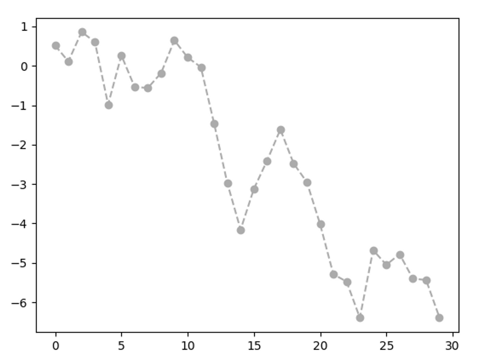
  # 색상, 마커, 선 스타일
  def marker_lineplot():
      from numpy.random import randn
      # plt.plot(randn(30).cumsum(), 'ko--') # 마커 스타일 지정
      plt.plot(randn(30).cumsum(), color='#ababab', linestyle='dashed', marker='o') # 색깔, 선 스타일, 마커 지정
      plt.show()
그래프 꾸미기 - 눈금, 라벨, 범례
아무런 인자 없이 호출하는 경우, 현재 설정되어 있는 매개변수의 값 반환 (현재 x축의 범위 반환)
x축 눈금이 포함된 간단한 그래프
  def label_graph():
      fig = plt.figure()
      ax = fig.add_subplot(1,1,1)
      ax.plot(np.random.randn(1000).cumsum())
      plt.show()
- x축 눈금 지정 :
plt.figure.set_xticks([]) - x축 눈금에 이름 라벨 지정 :
plt.figure.set_xticklables([])- rotations 옵션 : 왼쪽으로 회전할 각도 지정 (음수인 경우 오른쪽으로 회전)
- fontsize 옵션 : 폰트 크기 지정
plt.figure.set_title(): 서브플롯의 제목 지정plt.figure.set_xlabel(): 축의 이름 지정
# 눈금, 라벨, 범례
def label_graph():
    fig = plt.figure()
    ax = fig.add_subplot(1,1,1)
    ax.plot(np.random.randn(1000).cumsum())

    # x축 눈금 변경
    ticks = ax.set_xticks([0, 250, 500, 750, 1000]) # 전체 데이터 범위를 따라 눈금 배치 지정
    labels = ax.set_xticklabels(['one', 'two', 'three', 'four', 'five'],
                                rotation=-30, fontsize='small') # 다른 눈금 이름 라벨 지정
    ax.set_title('My Frst matplotlib plot') # 서브플롯의 제목 지정
    ax.set_xlabel('Stages') # x축에 대한 이름 지정

    plt.show()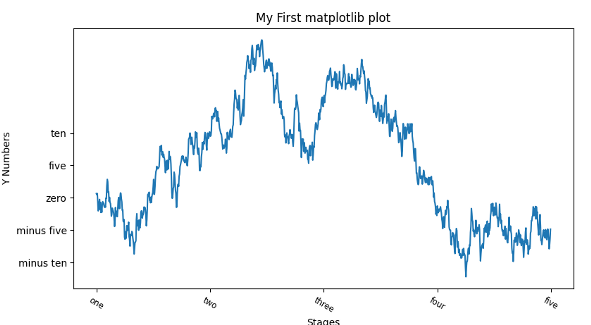
속성 한 번에 지정하기
# 그래프 속성 한 번에 지정하기
def graph_properties():
    fig = plt.figure()
    ax = fig.add_subplot(1,1,1)
    ax.plot(np.random.randn(1000).cumsum())
    props = {
        'title': 'My First matplotlib plot',
        'xticks': [0, 250, 500, 750, 1000],
        'xticklabels': ['one', 'two', 'three', 'four', 'five'],
        'xlabel' : 'Stages',
        'yticks' : [-10,-5,0,5,10],
        'yticklabels' : ['minus ten', 'minus five', 'zero', 'five','ten'],
        'ylabel': 'Y Numbers'
    }
    ax.set(**props)
    plt.show()
범례 추가하기
3개의 그래프에 각각 라벨을 지정하고, 범례 legend를 표시하자
legend(loc=''): loc 인자에 범례의 위치를 지정 (best 지정)# 그래프 범례 지정하기 def graph_legend(): from numpy.random import randn fig = plt.figure() ax = fig.add_subplot(1,1,1) ax.plot(randn(1000).cumsum(), 'k', label='one') ax.plot(randn(1000).cumsum(), 'k--', label='two') # dashed ax.plot(randn(1000).cumsum(), 'k.', label='three') # dot ax.legend(loc = 'best') # 범례 위치 지정 plt.show()
주석과 그림 추가하기
그래프에 추가적으로 글자나 화살표, 다른 도형으로 주석을 그리고 싶은 경우 여러 함수(text, annotate, arrow) 를 이용해 추가 가능
text(): 그래프 내에 주어진 좌표(x,y)에 부가적인 스타일로 그림을 그려줌plt.annotatetext: 주석 문자열
xy: 주석 위치 지정
xytext: 주석 문자열의 위치
arrowprops: 화살표의 속성
# 주석과 그림 추가하기
def graph_with_text_picture():
  from datetime import datetime

  fig = plt.figure();
  ax = fig.add_subplot(1,1,1)

  data = pd.read_csv('examples/spx.csv', index_col = 0, parse_dates=True)
  spx = data['SPX']

  spx.plot(ax=ax, style='k-')

  # 재정 위기 중 중요한 날짜를 주석으로 추가하기 (datetime, string 튜플 데이터 리스트)
  crisis_data = [
      (datetime(2007, 10, 11), 'Peak of bull market'),
      (datetime(2008, 3, 12), 'Bear Stearns Fails'),
      (datetime(2008, 9, 15), 'Lehman Bankruptcy')
  ]

  for date, label in crisis_data:
      # x,y 좌표로 지정한 위치에 라벨 추가
      ax.annotate(label, xy=(date, spx.asof(date)+75),
                  xytext=(date, spx.asof(date)+225),
                  arrowprops=dict(facecolor='black', headwidth=4, width=2, headlength=4),
                  horizontalalignment='left', verticalalignment='top')

  # 2007-2010 구간으로 확대 (그래프 x,y축의 시작과 끝 경계를 직접 지정)
  ax.set_xlim(['1/1/2007', '1/1/2011'])
  ax.set_ylim([600, 1800])

  ax.set_title('Important dates in the 2008-2009 financial crisis')

  plt.show()
도형 그리기
- matplotlib 에서는 일반적인 도형을 표현하기 위해 patches라는 객체를 제공
- Rectangle과 Circle 같은 것은 matplotlib.pyplot에서 찾을 수도 있지만 전체 모음은 matplotlib.patches에 포함되어 있다.
- patches 객체를 만들고, 서브 플롯에
plt.add_patch()를 호출하여 추가 가능
# 도형 그리기
def figures():
    fig = plt.figure()
    ax = fig.add_subplot(1,1,1)

    rect = plt.Rectangle((0.2, 0.75), 0.4, 0.15, color='k', alpha=0.3)
    circ = plt.Circle((0.7, 0.2), 0.15, color='b', alpha=0.3)
    pgon = plt.Polygon([[0.15, 0.15], [0.35, 0.4], [0.2, 0.6]], color='g', alpha=0.5)

    # 서브플롯에 추가하기
    ax.add_patch(rect)
    ax.add_patch(circ)
    ax.add_patch(pgon)

    plt.show()

def main():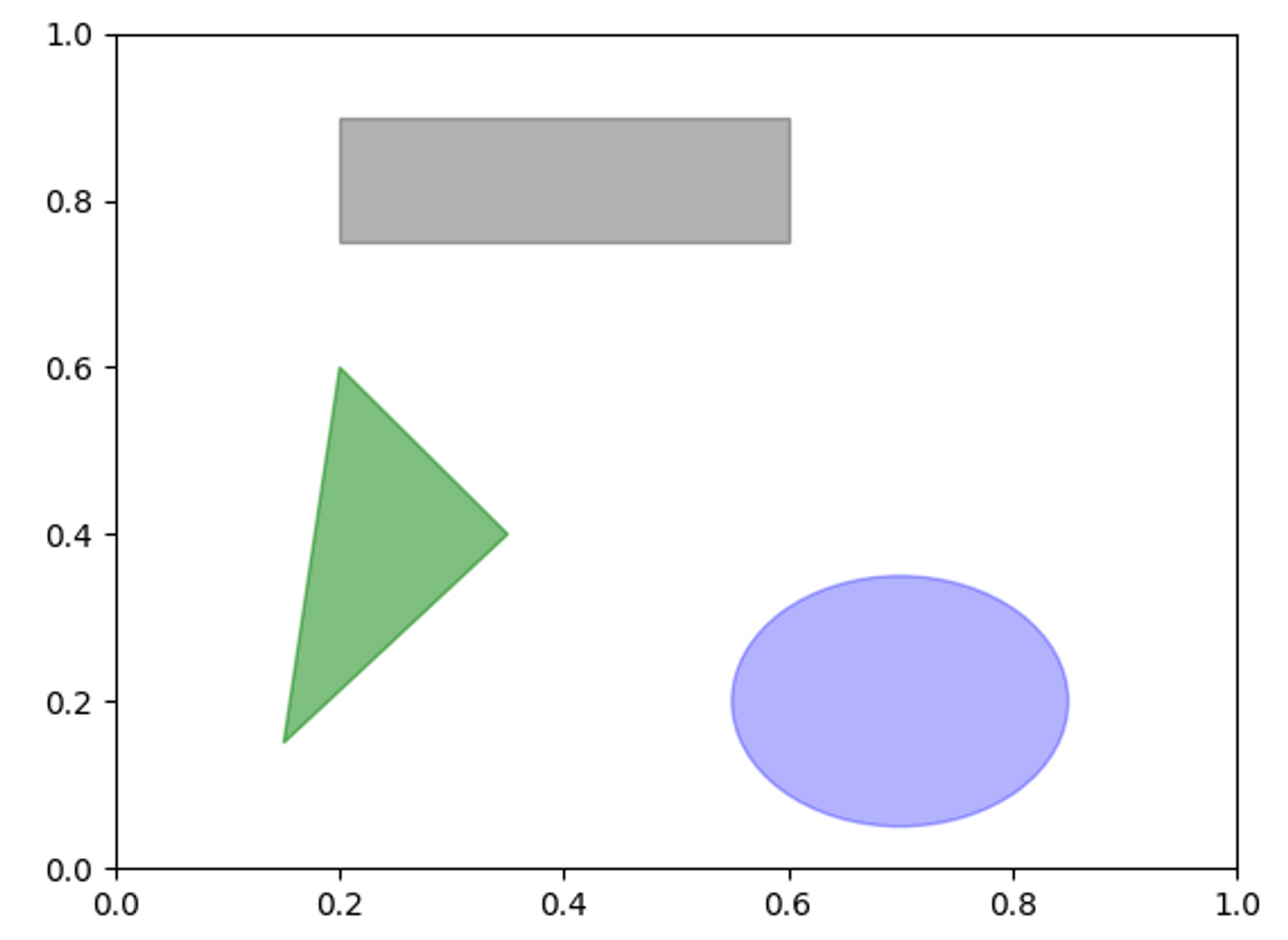
그래프를 파일로 저장하기
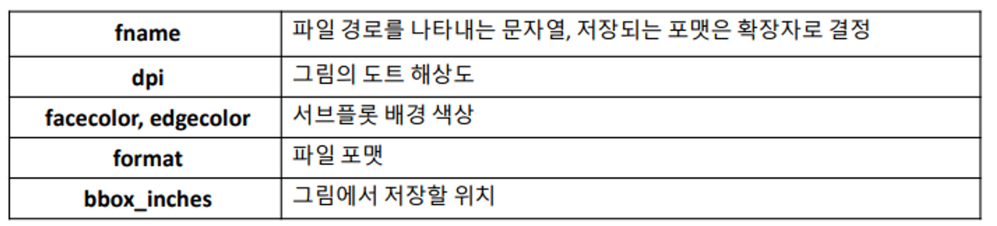
활성화된 figure은
plt.savefig()를 이용해 파일로 저장 가능 (파일 종류는 확장자로 결정됨)dpi옵션 : 인치당 도트 해상도 조절bboc_inches: 실제 figure 둘레의 공백을 잘라냄# savefig() 메서드를 이용해 파일 저장 (포맷 지정 가능) plt.savefig('saved/financial_crisis_graph.svg') # 최소 공백을 가지는 400DPI PNG 파일 생성 plt.savefig('saved/financial_crisis_graph.png', dpi=400, bbox_inches='tight')
BytesIO처럼 파일과 유사한 객체에 저장
  # 파일과 유사한 객체에 저장
      from io import BytesIO
      buffer = BytesIO()
      plt.savefig(buffer)
      plot_data = buffer.getvalue()
seaborn으로 그래프 그리기
pandas를 다루다 보면, 로우와 컬럼 라벨을 가진 다양한 컬럼의 데이터를 다루게 되는데, 통계 그래픽 라이브러리인seaborn을 통해 Series와 DataFrame객체를 간단하게 시각화 할 수 있다.
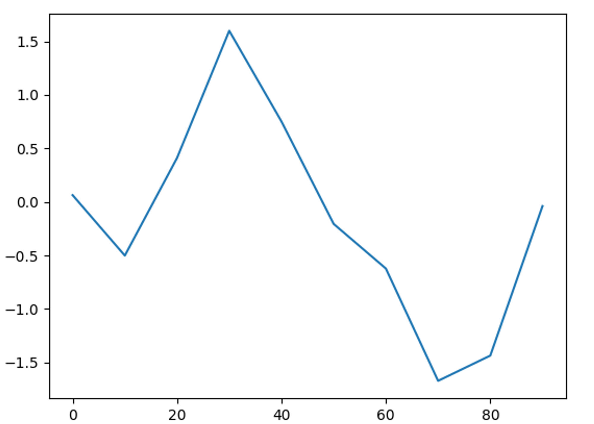
선 그래프 (Series)
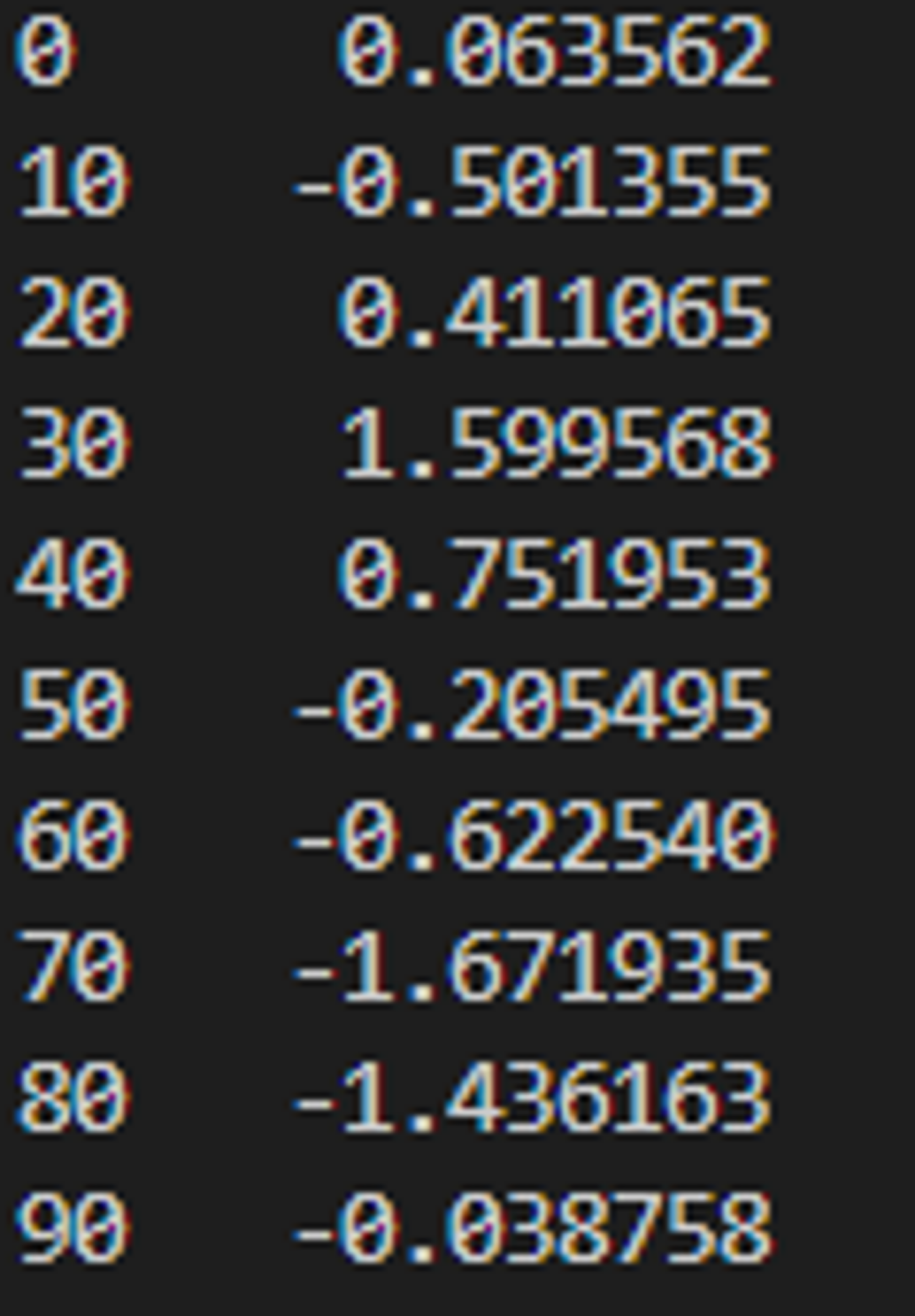
plt(): Series와 DataFrame을 plot 메서드를 이용해 다양한 형태의 그래프로 생성# 선 그래프 (Series 데이터) def line_plot_series(): # 인덱스는 0~90까지 10까지의 간격으로 설정 s = pd.Series(np.random.randn(10).cumsum(), index=np.arange(0,100,10)) print(s) s.plot() # x축이 인덱스, y축이 값 plt.show()
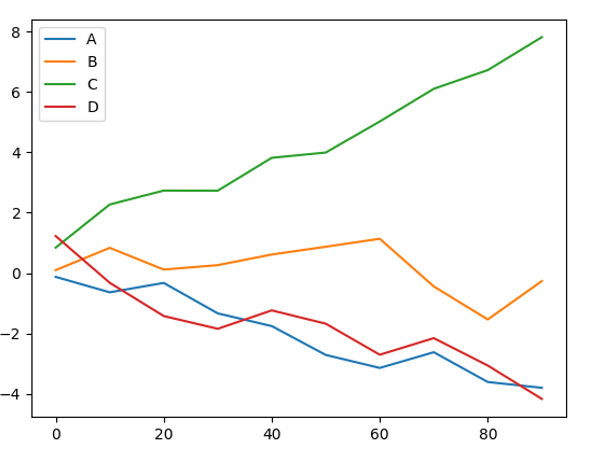
선 그래프 (DataFrame)
# 선 그래프 (DataFrame 데이터)
def line_plot_dataframe():
    df = pd.DataFrame(np.random.randn(10,4).cumsum(0),
                      columns=['A','B','C','D'],
                      index=np.arange(0,100,10))
    print(df)

    df.plot()
    plt.show()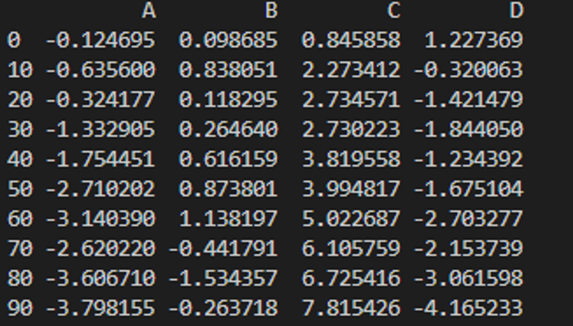
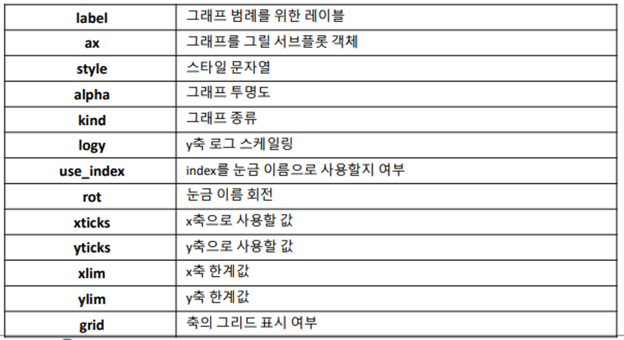
막대 그래프
plot.bar(),plot.barh(): 각각 수직 막대 그래프와 수평 막대 그래프를 그림Series, DataFrame의 색인은 수직 막대 그래프의 경우 x 눈금, 수평 막대 그래프인 경우 y 눈금으로 사용됨
  # 막대 그래프
  def bar_graph():
      fig, axes = plt.subplots(2,1)
      data = pd.Series(np.random.randn(16), index=list('abcdefghijklmnop'))

      data.plot.bar(ax=axes[0], color='k', alpha=0.7) # 수직 막대 그래프
      data.plot.barh(ax=axes[1], color='k', alpha=0.7) # 수평 막대 그래프

      plt.show()
막대 그래프 (DataFrame)
각 로우의 값을 함께 묶어서 하나의 그룹마다 각각의 막대를 보여줌
  # 막대 그래프 (dataframe)
  def bar_graph_dataframe():
      df = pd.DataFrame(np.random.randn(6,4),
                        index = ['one','two','three','four','five','six'],
                        columns=pd.Index(['A','B','C','D'], name='Genus')) # 범례의 이름을 Genus로 지정
      print(df)
      df.plot.bar()
      plt.show()
누적 막대 그래프로 표현
df.plot.barh(stacked=True, alpha=0.5) # 누적막대그래프로 표현
파티 예제
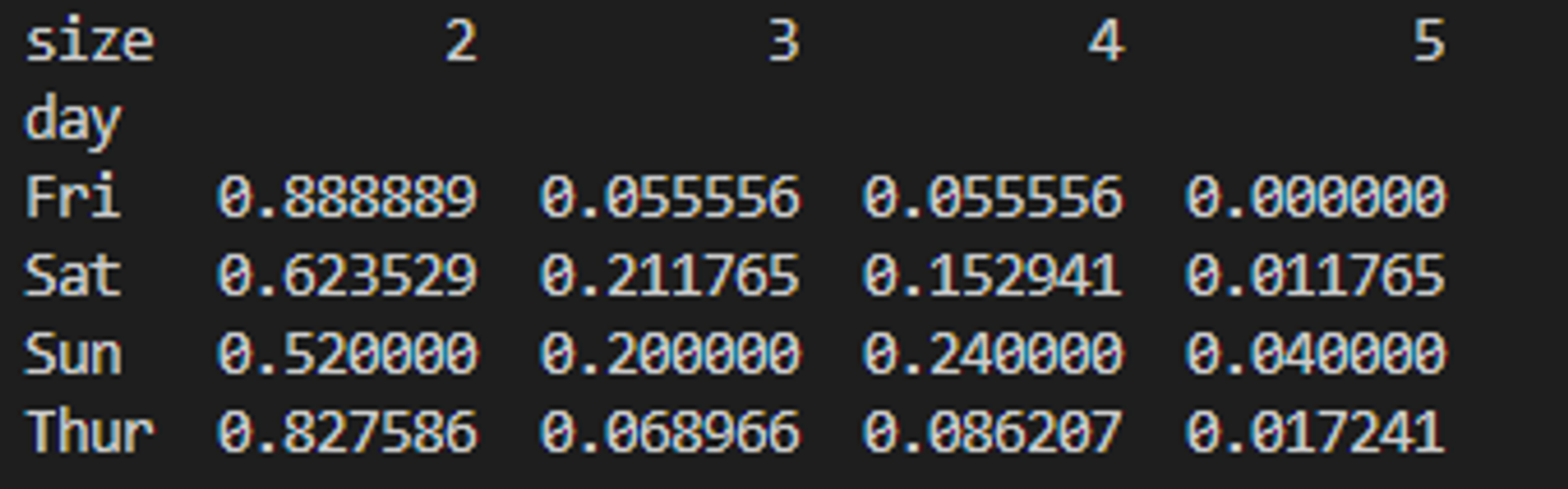
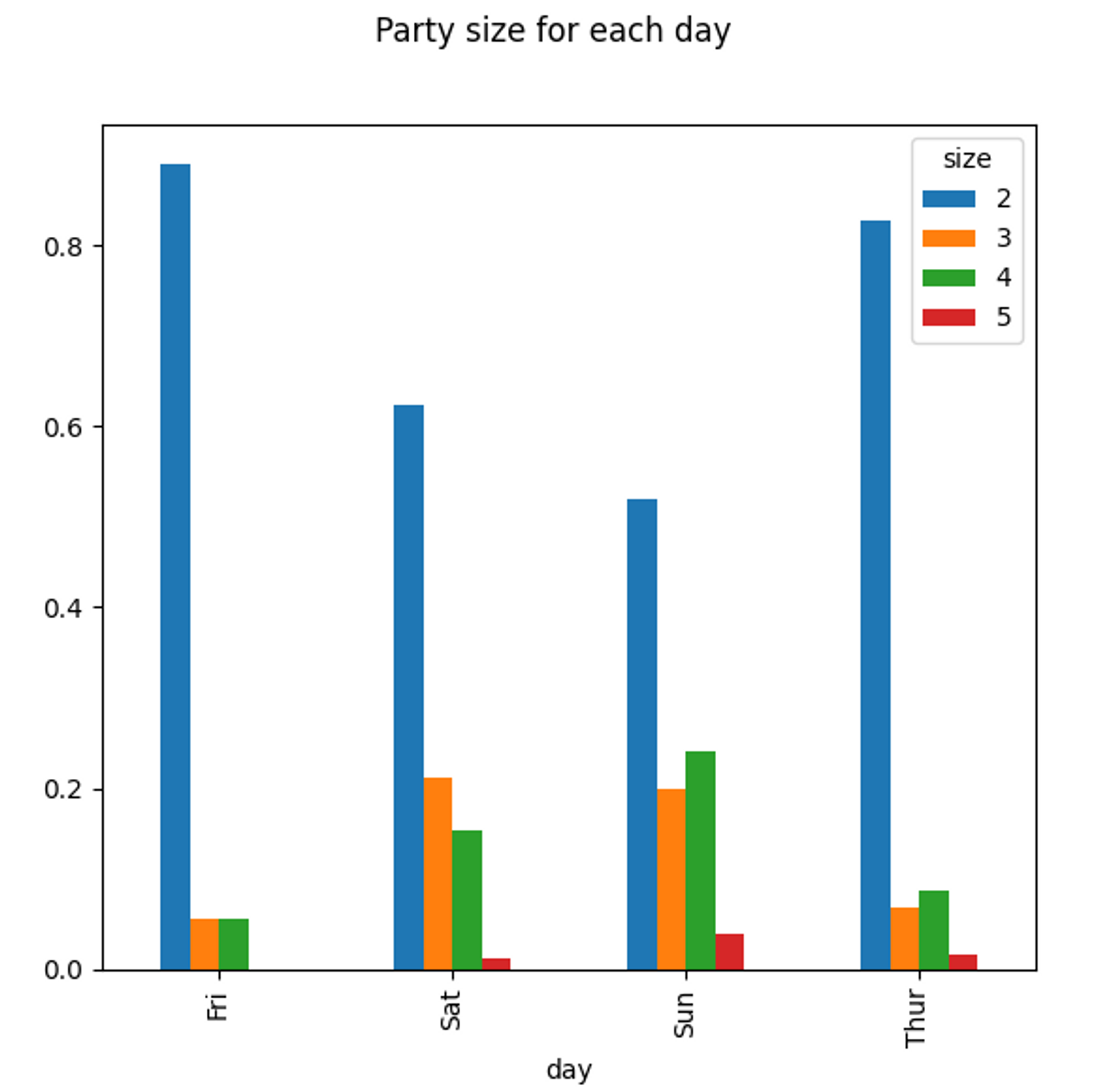
- 주말에 파티의 규모가 커지는 경향이 있음을 확인할 수 있음
# 파티 예제
def bar_grahh_party_tips():
    tips = pd.read_csv('examples/tips.csv')
    party_counts = pd.crosstab(tips['day'], tips['size']) # day별 size(요일별 사이즈)를 count하여 dataframe 만들기

    party_counts = party_counts.loc[:, 2:5] # 1인과 6인 파티는 제외
    print(party_counts)

    # 각 로우의 합이 1이 되도록 정규화하고 그래프 그리기
    party_pcts = party_counts.div(party_counts.sum(1), axis=0)
    print(party_pcts)

    party_pcts.plot.bar()
    plt.suptitle("Party size for each day")
    plt.show()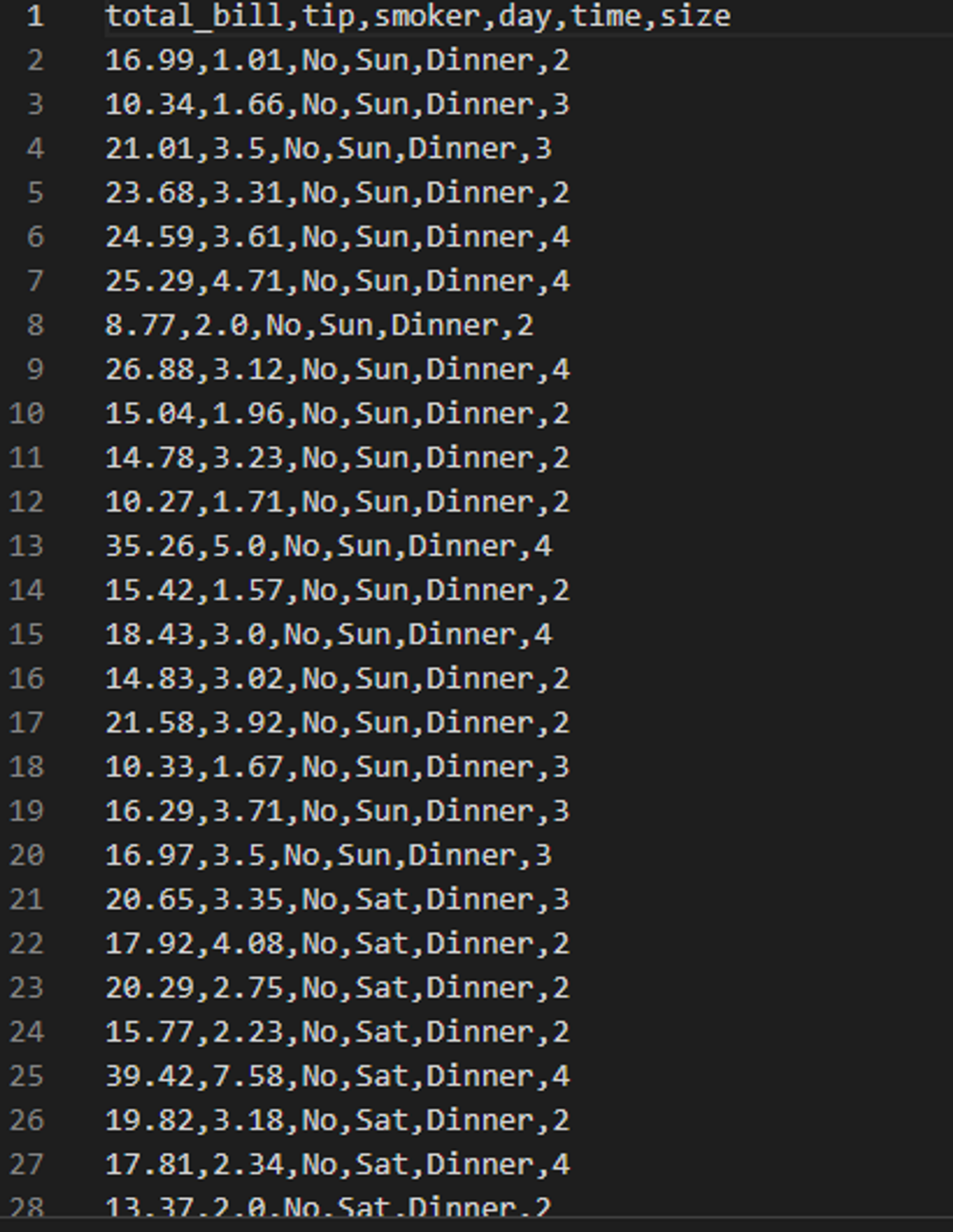
seaborn으로 팁 데이터 그리기
seaborn플로팅 함수의 data 인자: pandas의 DataFrameday 컬럼의 각 값에 대한 데이터는 여럿 존재하므로, tip_pct의 평균값으로 막대 그래프를 나타내고, 검은 선은 95%의 신뢰 구간을 나타냄
hue 옵션: 추가 분류에 따라 나눠 그릴 수 있음
import seaborn as sns

# seaborn으로 팁 데이터 다시 그리기
def seaborn_bar_party():
  tips = pd.read_csv('examples/tips.csv')

  # tips의 비율을 나타내는 새로춘 컬럼 추가하기
  tips['tip_pct'] = tips['tip'] / (tips['total_bill'] - tips['tip'])
  print(tips.head())

  sns.barplot(x='tip_pct', y='day', hue='time', data=tips, orient='h')
  sns.set(style='whitegrid')
  plt.show()

hue=time으로 지정한 경우
hue=smoker으로 지정한 경우
히스토그램과 밀도 그래프
히스토그램: 값들의 빈도를 분리하여 그래프로 표현
데이터 포인트는 분리되어 고른 간격의 막대로 표현되며, 데이터의 숫자가 막대의 높이로 표현됨
  # 전체 결제금액 대비 팁 비율을 히스토그램으로 표현
  def histogram_party():
      tips = pd.read_csv('examples/tips.csv')
      tips['tip_pct'] = tips['tip'] / (tips['total_bill'] - tips['tip'])

      tips['tip_pct'].plot.hist(bins=50) # 간격은 50으로 설정

      plt.suptitle('Ratio of Tips Compared to Total bills')
      plt.show()
밀도 그래프: 관찰값을 사용해서 추정되는 연속된 확률 분포를 그림
tips['tip_pct'].plot.density()kernel()을 이용해 이 분포를 근사하는 방법(Kernel Density Estimate) 그래프

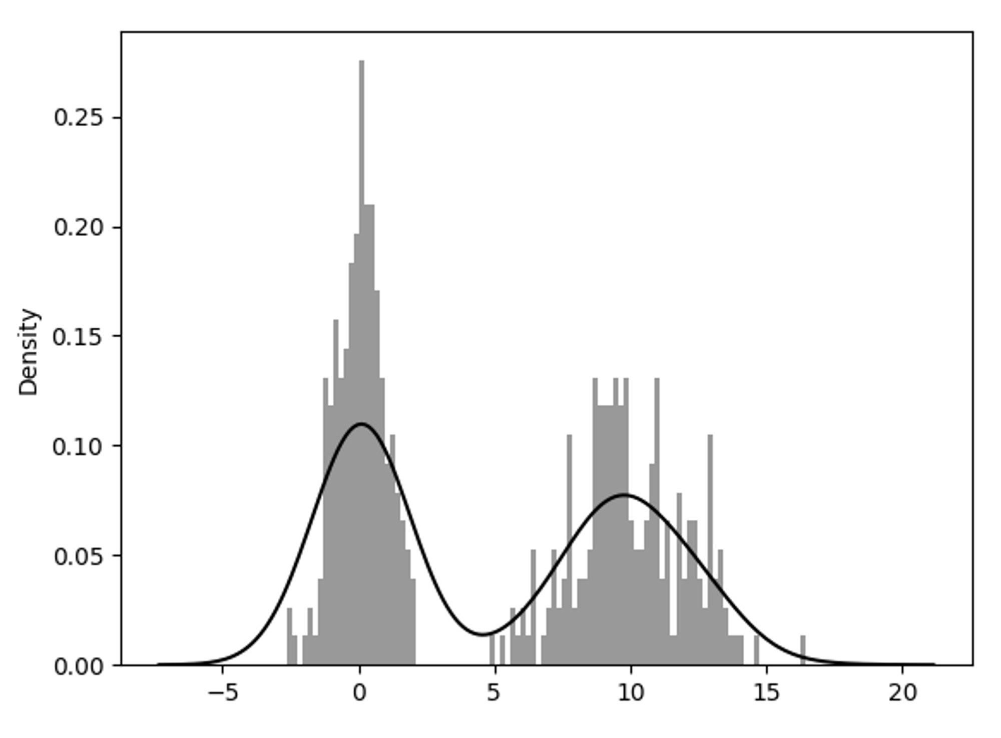
정규 횬합 히스토그램과 밀도 추정
sebaorn.distplot() : 히스토그램과 밀도 그래프를 한 번에 손쉽게 그리기
- 두 개의 다른 표준정규분포로 이루어진 양봉분포(bimodal distribution)
산포도 표현
산포도(scatter plot) : 2개의 1차원 데이터 묶음 간의 관계를 나타내고자 할 때 유용한 그래프
seaborn.regplot()을 이용해 산포도와 선형 회귀 곡선 함께 그리기
-산포도 행렬 : 탐색 데이터 분석에서 변수 그룹 간의 모든 산포도를 살펴보는 일
seaborn.pairplot()을 이용해 대각선을 따라 각 변수에 대한 히스토그램이나 밀도 그래프 생성
패싯 그리드와 범주형 데이터
패싯 그리드 : 추가적인 그룹 차원을 가지는 데이터, 다양한 범주형 값을 가지는 데이터를 시각화
seaborn.factorplot()→ renamed tocatplot()# 패싯 그리드와 범주형 데이터 def factors_plot(): tips = pd.read_csv('examples/tips.csv') tips['tip_pct'] = tips['tip'] / (tips['total_bill'] - tips['tip']) sns.catplot(x='day', y='tip_pct', row='time', col='smoker', kind='bar', data=tips[tips.tip_pct<1]) plt.show()
박스플롯 (boxplot)
중간값, 사분위, 특잇값 표현에 적합한 그래프


